Introducing: Monthly Design Walks
Our studio is launching monthly design inspo walks where we will visit different local shops and grocers to review some of the standout packaging we come across.

Our studio is launching monthly design inspo walks where we will visit different local shops and grocers to review some of the standout packaging we come across.
For our inaugural packaging walk, we kept it local and went to the Brentwood Country Mart to check out what restaurant and boutique grocer, Farmshop, has in stock after the holiday season. Check out our highlights below + thoughts on what's goin on in food and bev.
We walked away from this shopping visit with a specific question to chew on: "For these brands, what is their ideal use case, and who is their ideal customer?"
At the end of the day, successful brand design centers around being able to effectively and visually design for the answer to this question. CPG food and bev brands need to have a clear understanding of who they are serving in order to lay out their products effectively.
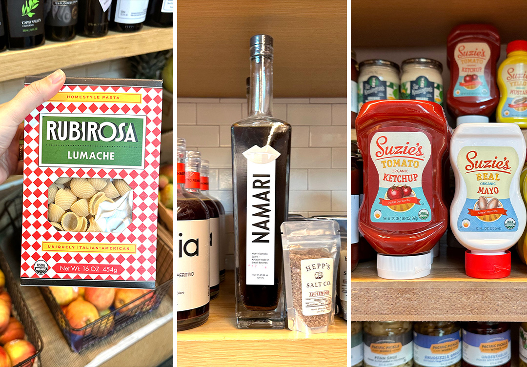
In the context of our visit today, some products will serve more as a memorable gift than a pantry staple, and the packaging should reflect that in order to speak to the right person. Take Namari for example - their stunning bottle looks great on shelf and serves as a fantastic giftable item, but may not really explain who they are to someone looking to stock their home bar. Suzie's on the other hand really speaks to those looking for a pantry staple that tastes good and will work for their family.
Some products are just so good that they are a win win in both categories, but don't make the mistake of designing too broad from the get go. Know who you are designing for, and obsess over them in ever step of your design process.
A SoCal brand studio working with lifestyle, hospitality, and CPG brands.